
Dathic: Start-Up Product Redesign
End-to-end development of a Start-Up’s main product by creating a Design System, modern UI, and responsive design for both consumer and client facing features.
OVERVIEW
Redesign of a client-facing feature for Dathic, a B2B data company. Their Store Locator feature needed to be efficient, user-friendly, and modern for both clients and consumers.
ROLE
UX Designer working with a team of fellow designers, software engineers, marketing director, and CEO.
DURATION
3 week sprint
METHODS AND TOOLS
Market Research
Heuristic Analysis
Competitive and Comparative Analysis
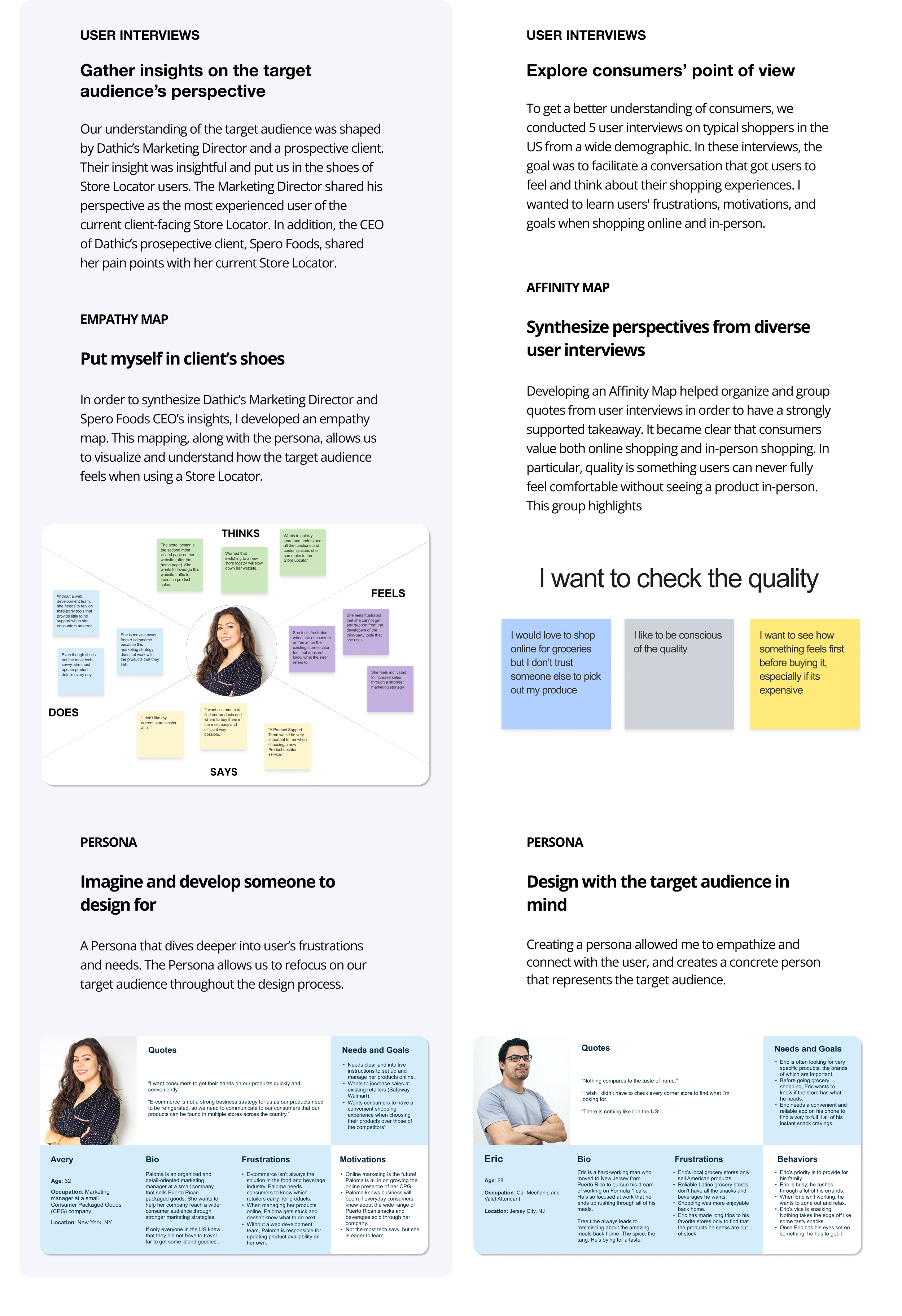
User Interviews
Affinity Map
Persona
Empathy Map
Wireframe and Prototyping
Usability Testing
UI Design
Tools: Figma, Notion, Canva, Pen + Paper
SOLUTION OVERVIEW
Dathic’s main feature had to be walked through and explained to each clients. The improved Store Locator is intuitive and easy to learn for new users — for both Dathic’s clients and consumer:

In addition to a modern upgrade, Dathic needed an onboarding process for new users. In order to be a fully self-sufficient product, the Store Locator needed a tutorial using specific UX Copy.
Client-Facing Store Locator Settings/Customization
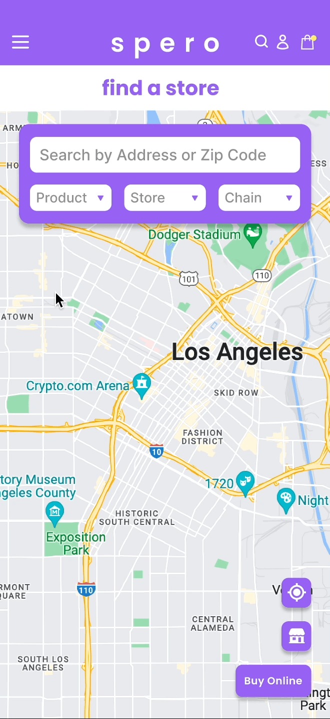
Consumer-facing Store Locator
Onboarding UX copy for new clients
Continue reading to explore the research and design process, and a more in-depth and detailed solution.
CONTEXT
Dathic: Data Analysis Company
What does Dathic provide their clients and consumers?
Dathic is a data and AI company that facilitates connection between brands with diverse consumers. Their focus is to provide small/medium sized businesses with actionable data insights. Although initially focused on Hispanic communities, they are now expanding to other communities.
Why: Dathic’s mission is to bridge the gap between businesses and consumers. Through market insights and data analytics predictions, they provide businesses with useful data on consumers, while providing consumers with useful product details. This helps Dathic’s clients better understand their audience, and benefit their company through data.
How: The Store Locator is one of Dathic’s main data strategy features. Dathic’s clients use the Store Locator to upload products available for sale, and show where these products can be found for purchase. Everyday consumers can go to a company’s website and search the closest store that sells the products they desire.
CHALLENGE
How can we help Dathic?
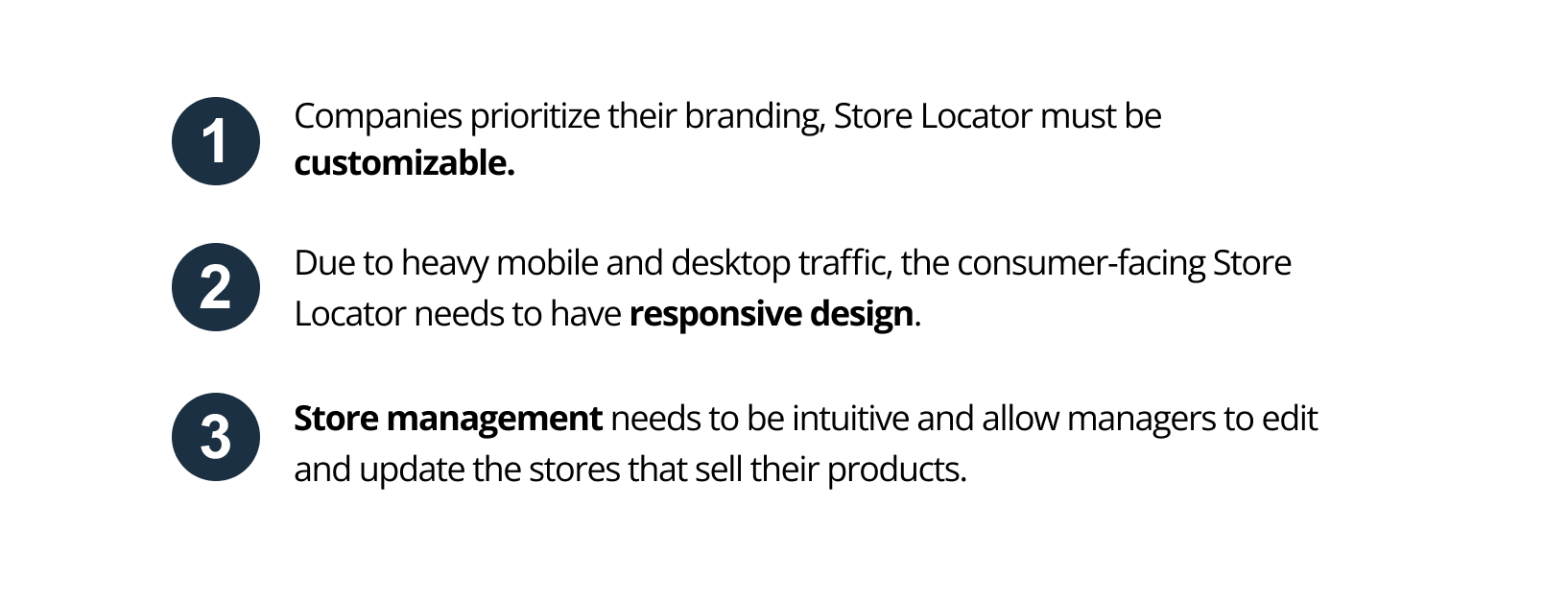
Currently, Dathic’s Marketing Director has to teach every new client about the Store Locator and its features. Their goal is update the UI to a modern, user-friendly and self-serviceable tool for their clients and consumers.
Discussing goals and limitations with Dathic’s team
MARKET RESEARCH
Determine direction by analyzing competitors
Dathic’s direct competitors are Storemapper, StorelocatorWidgets, Stockist, and Destini. We used them to compare and contrast features with a Competitive and Comparative Analysis.
HEURISTIC ANALYSIS
Identify usability and learnability issues
Evaluation of the Client-Facing Store Locator highlighted usability issues so we could find specific areas for improvements. Learnability issues were the most severe heuristic violation.


CLIENT VS CONSUMERS
Acknowledge two different audiences
As we dived into our research, we learned that we must have two different target audiences.
Consumers that use the Store Locator to find products
Account Managers that use the client-facing Store Locator to set up and manage their products availability (small/medium sized businesses).
We needed to create this distinction as it helped us understand Dathic’s business, clients and consumers on a deeper level.
Client Research
Consumer Research
DEFINE
Client’s Problem
Sales and marketing managers at CPG enterprises need to clearly communicate to consumers where their products are sold so that they can expand the reach of their products across diverse communities in the U.S.
Client’s Solution
The Store Locator is a tool embedded in a CPG company’s website that shows which retailers carry their products.
With the Store Locator, sales and marketing managers can create, update, and delete:
Products for sale
Brick-and-mortar stores that sell these products
E-commerce businesses that sell these products
Product and store reviews
The Store Locator will also provide the CPG enterprise’s sales and marketing teams with real-time analytics to guide their business strategy.
Consumer’s Problem
Everyday consumers need to know where their favorite food and beverage products are sold so they can satisfy their food cravings and feel connected to their home country through culinary experiences.
Consumer’s Solution
The consumer-facing Store Locator provides timely and relevant information to consumers about where their favorite products are sold and how they can buy these products regardless of one’s location.
Through the Store Locator, consumers can identify the nearest store that sells the product that they seek, quickly find a store’s hours, read through store and product reviews, and get navigation directions to the store so that they can get their desired items ASAP.
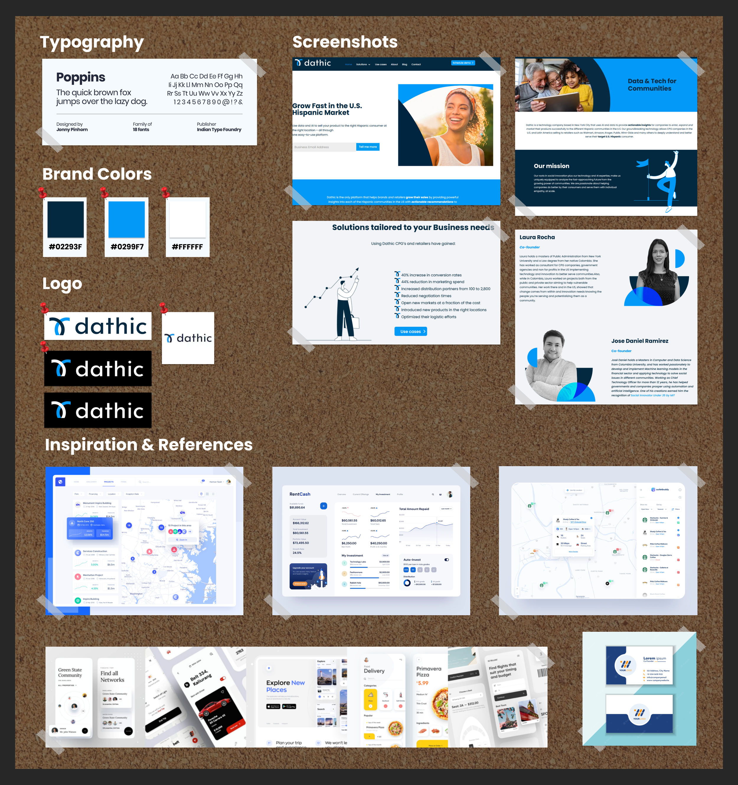
MOOD BOARD
Brainstorming the modern feel
Creating a mood board lightened up the design process in a high intensity environment. It allowed us to have a vision for the feelings we wanted the modern design to be assisted with. If the team had inspiration from the same visual board, we could all reference the same feeling.
We decided on typography and colors that reflected the current brand website. On the bottom of our mood board, we added examples of clean and modern interfaces found across different dashboard and apps.
DESIGN: CLIENTS
Wireframe and groundwork
Our redesign started with a mid-fidelity prototype of the client facing store locator in Figma. We ambitiously focused on modernizing the original store locator design, and making the 3 functions/features the client must interact with intuitive. We tried different versions of tabs, knowing that usability tests would reveal the design with the best memorability.
Wireflow of the mid-fi prototype shows our initial information structure and foundation of our redesign.
USABILITY TESTS
Testing and Iterations
Feedback is incredibly valuable and insightful in the design process. We dived into our usability testing with 4 users and also with Dathic’s team.
FINAL PROTOTYPE
Solution to Dathic’s three challenges
With our mood board in mind, we added color and heavily focused on updating the settings page on the high-fidelity prototype.
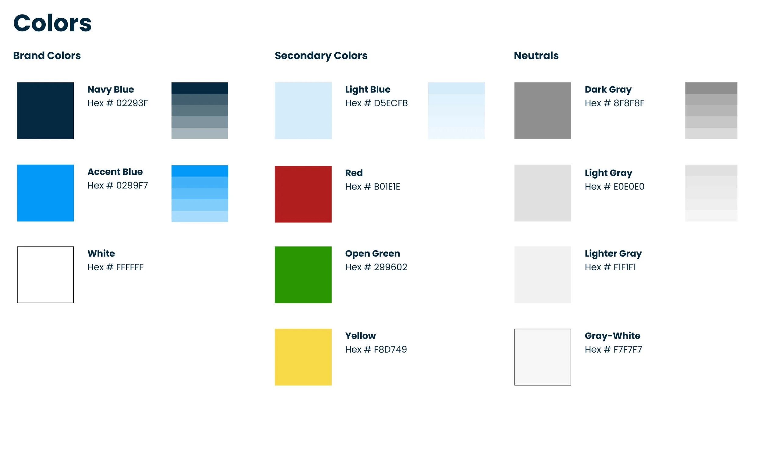
DESIGN SYSTEM & COMPONENT LIBRARY
Style guide and resource for front-end engineers
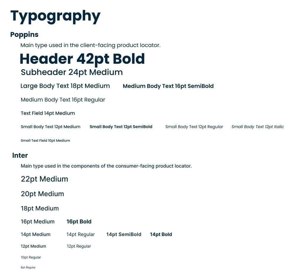
The design system, like the mood board, also highlights the main font and colors to incorporate into our high-fidelity prototype. We included Inter as a font pairing to Poppins, and created the hierarchy of header/sub-header/body text with their specific weight and size. The secondary color accents of red, green and yellow were incorporated for the error/success alerts.
During this process, we also developed and improved our consistency through a Component Library. This not only helped our team’s organization and standardization, but also helped communicate our consistent text, buttons, icons, etc. to the front end software engineer implementing our design for Dathic.

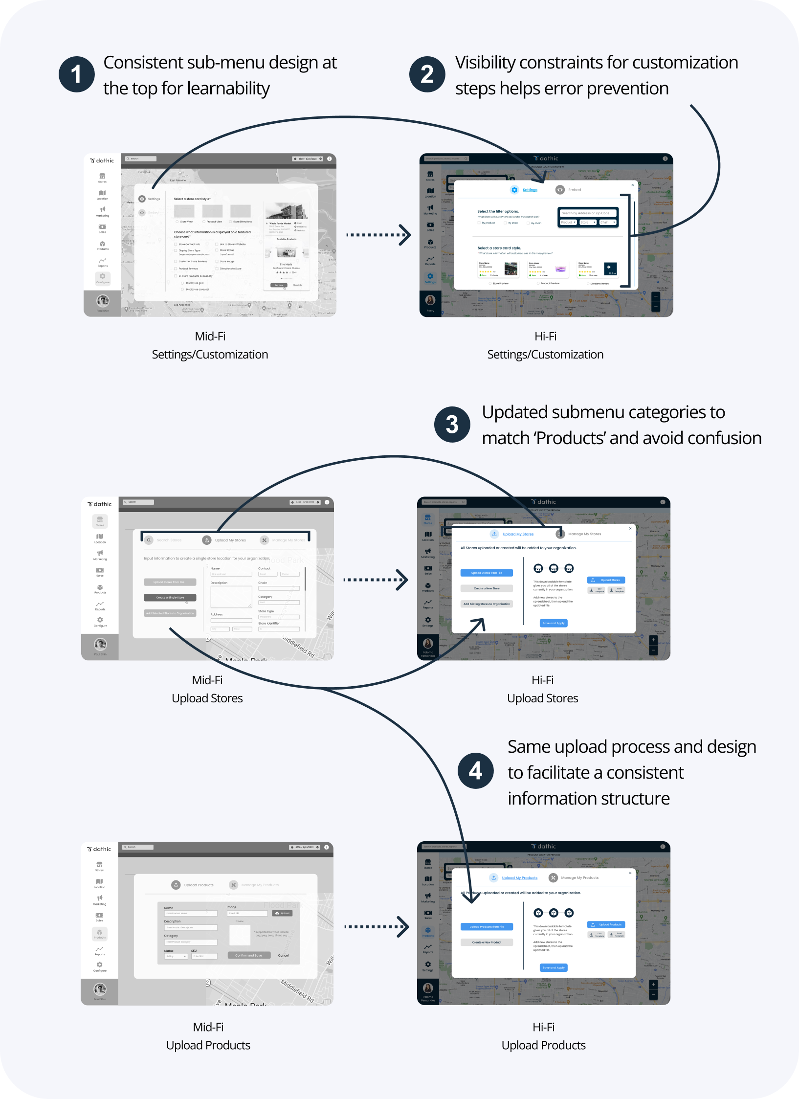
FINAL PROTOTYPE
Solution to Dathic’s three challenges
With our mood board in mind, we added color and heavily focused on updating the settings page on the high fidelity prototype.
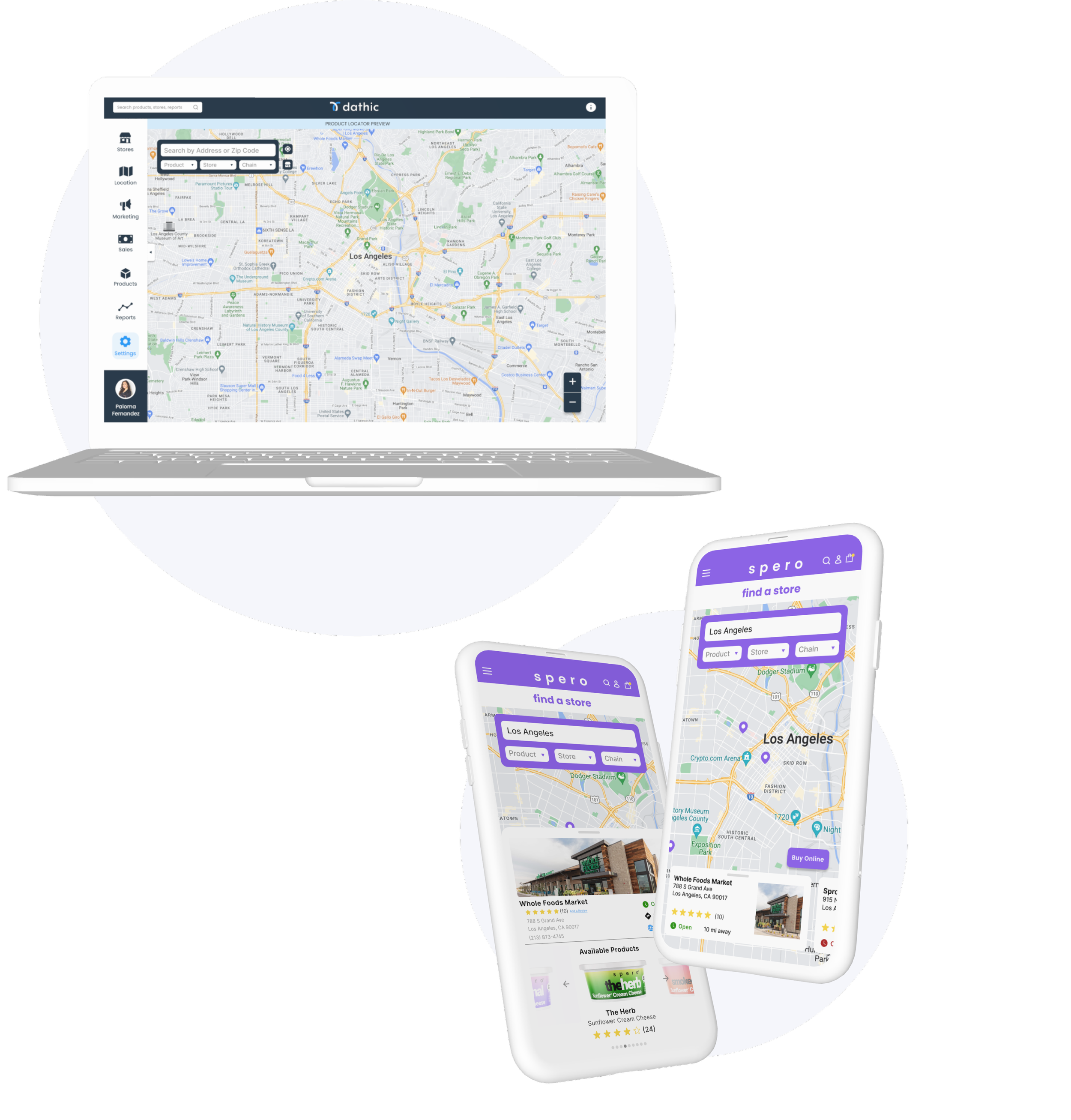
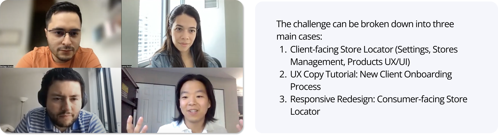
1. Client-Facing Store Locator
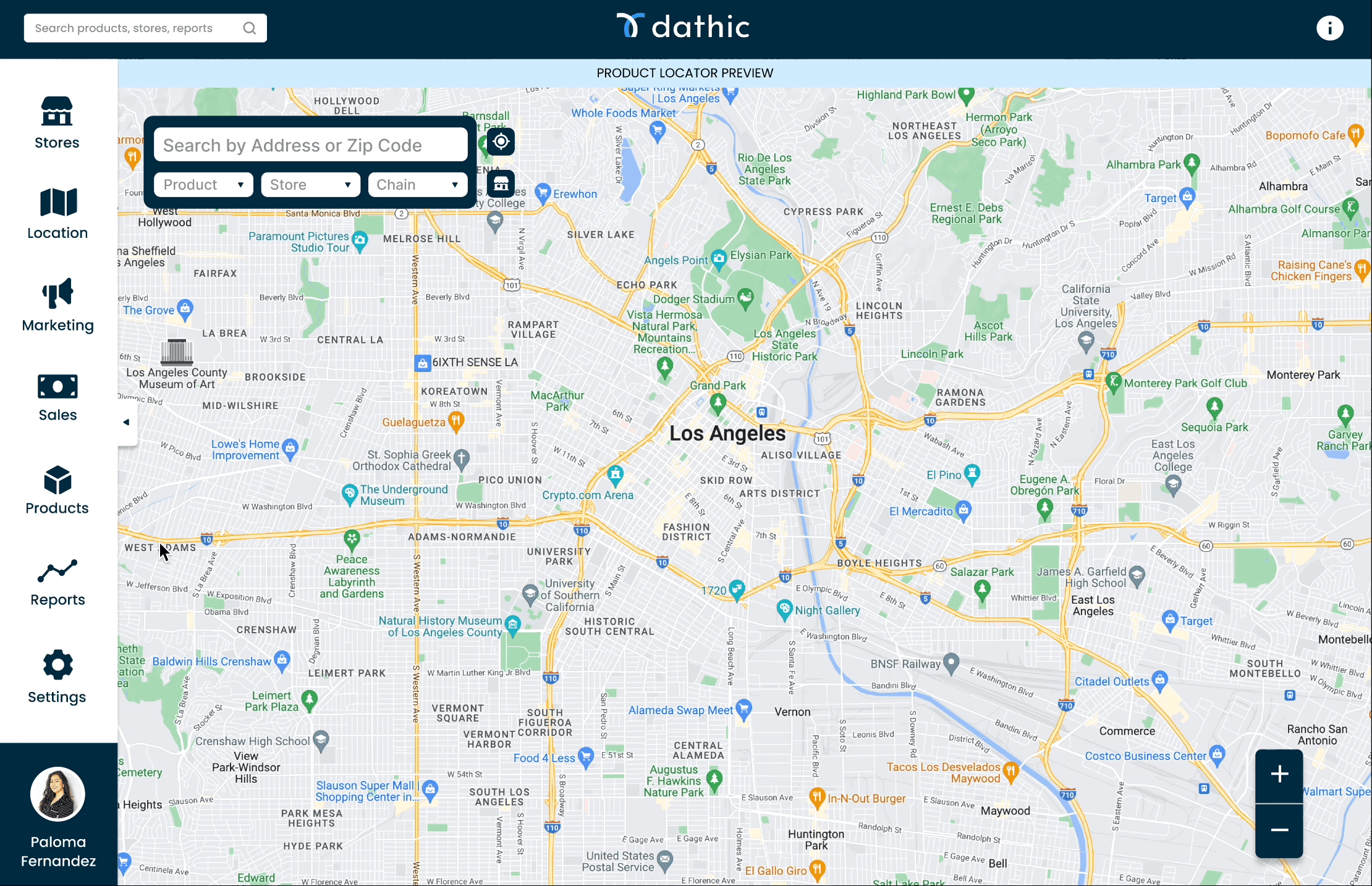


Settings: Customization for users
Wireflow using Mid-Fi prototype
Products: Uploading and managing
Stores: Managing stores that sell your product
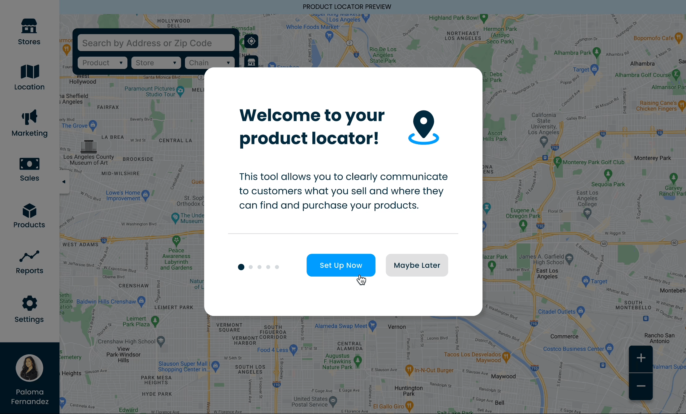
2. New Client Onboarding Process
Step-by-step tutorial for new clients to understand Store Locator features
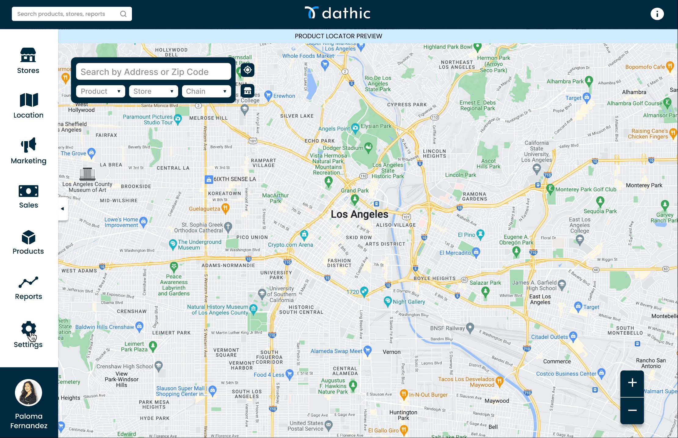
3. Consumer-facing Mobile Design
Adapted from our Desktop design, we upgraded the responsive mobile design. With our consumer persona in mind, we developed a modern and user-centered design that provides users with timely and relevant information to find products uploaded by Dathic’s clients.
Reflection
Reflecting on our journey, the 3 week sprint was an incredible and invaluable learning experience.
We were able to collaborate directly with Dathics' team of software engineers, marketing director, and CEO.
Creating a strong report with engineers clarified design constraints and project scope.
UX in the real world is not always linear. In other words, the fast paced B2B environment pushed me to adapt my research and design process in a business and team environment.