eBay: Identity Verification
eBay was losing over $20,000 per week due to failed ID verification submissions. By designing and implementing a seamless, end-to-end verification experience within the app, I reduced failed verifications by 85%, driving substantial cost savings and reinforcing trust and security across the marketplace. This transformation is saving eBay thousands of dollars daily while making the platform safer and more reliable for millions of users.
OVERVIEW
To maintain eBay as a safe and trusted marketplace, a seamless ID verification experience must be integrated into the eBay app.
Currently, eBay incurs $4,000 per day due to avoidable errors in the desktop ID verification process. By implementing a frictionless, error-resistant UX/UI, optimizing real-time feedback, and enhancing usability, we can drastically reduce failed verifications, drive significant cost savings, and reinforce user trust and security across the platform.
ROLE
UX Designer collaborating closely with designers, software engineers, product managers, and key stakeholders to drive user-centered solutions.
METHODS AND TOOLS
Heuristic Analysis
Competitive and Comparative Analysis
Data Analysis
Journey Mapping
User Flow
Information Architecture
Usability Testing
Rapid Iteration
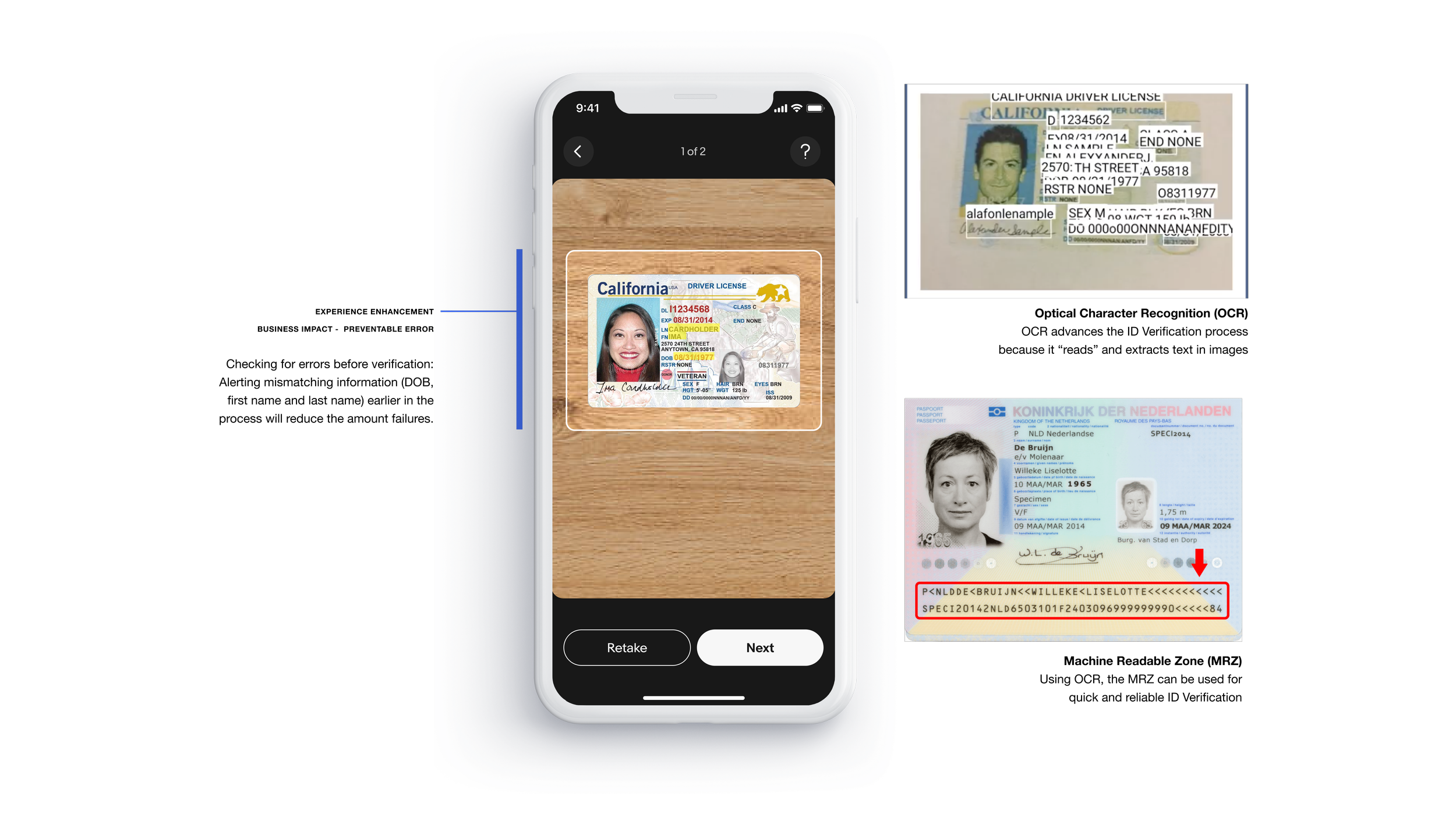
OCR
Responsive Design
eBay Design System
Wireframe and Prototyping
Tools: Figma, Monday.com, Pen + Paper
DURATION
1 Quarter
Solution Overview
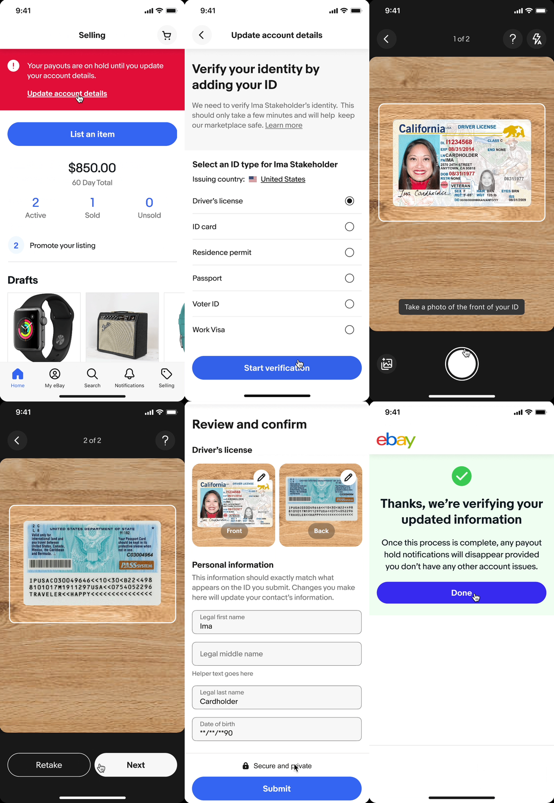
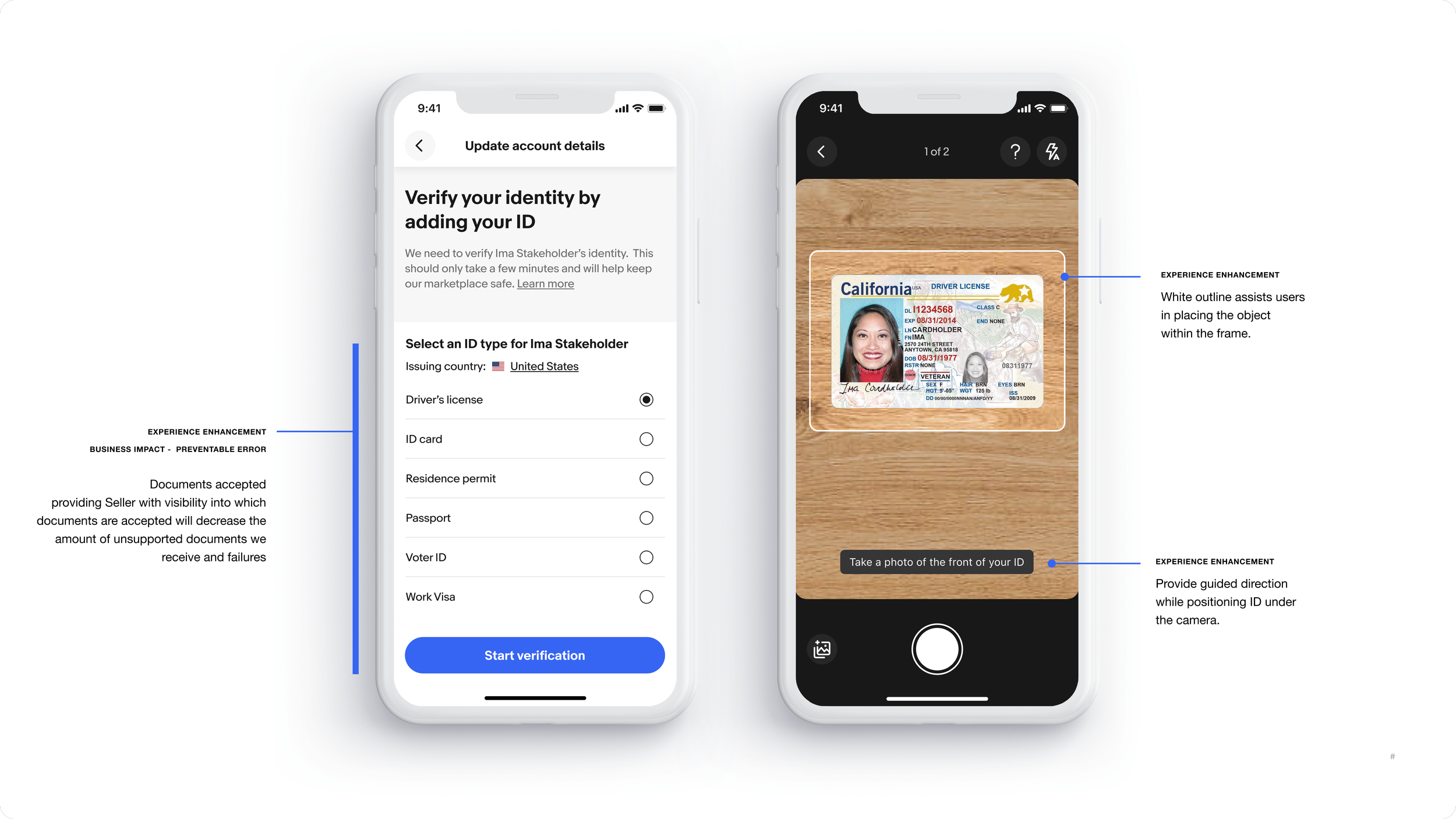
Designed an intuitive ID upload experience that guides users through the verification process, ensuring accurate submissions and clear outcomes. This improved Identity Verification system helps eBay eliminate soft errors, authenticate credible sellers with confidence, and proactively remove bad actors, strengthening trust and security across the marketplace.
Identity Verification “Happy Path”
Personal Impact
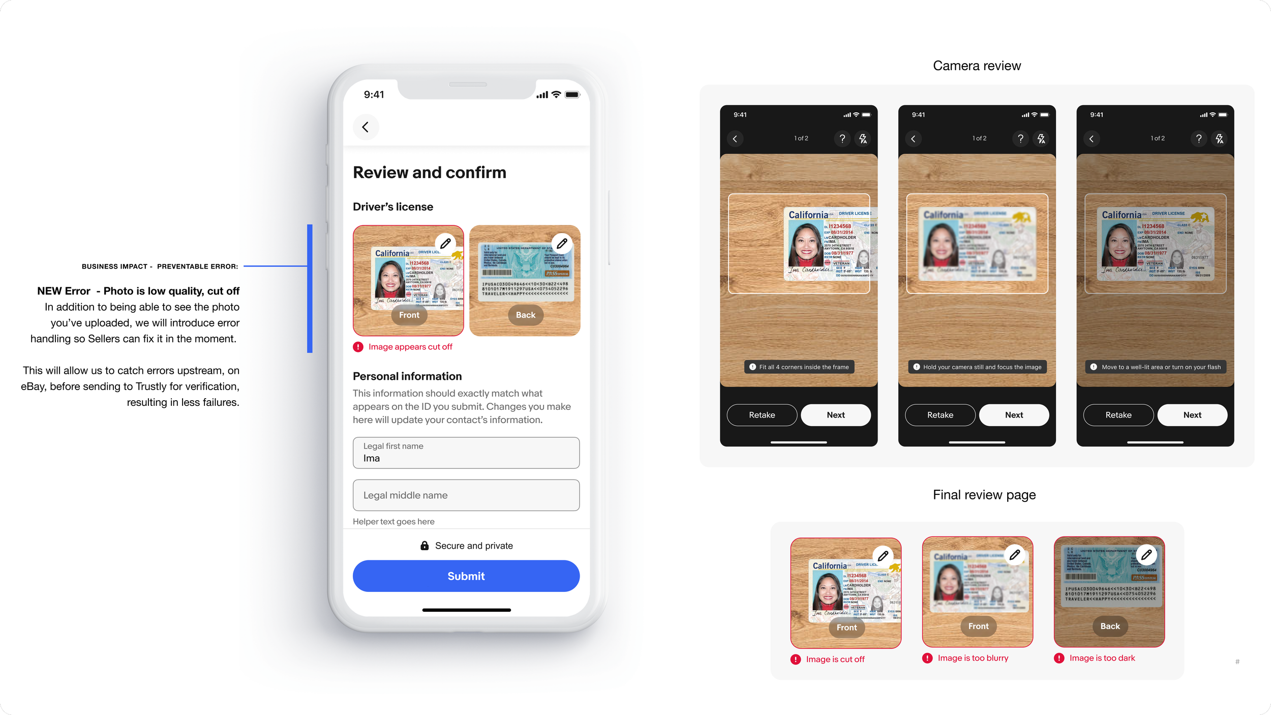
Analysis of the following quarter showed immediate promising results. There was a significant decrease in “soft fails” where ID's were either too blurry, dark, out of frame, or bad quality. In addition, there was a spike in new verified users, showing that the new ID verification process on the eBay app was a big improvement from the outdated Web experience.
My design process led to many key features such as the list view, camera mode view, directional text, and error states. The UI and user experience all rooted from the project mission — guiding users to an error and resistance-free ID verification process. With the mission in mind, I spearheaded the UI improvements through C&C analysis, rapid iteration and user-testing.
Reflection
This project got picked up really fast, and quickly became a challenge. It was a great opportunity for me to improve my adaptability in real time and I hope to continue to evolve as a designer and person everyday.
Visual options are useful for communication and alignment on a tech team. It’s one thing to talk and discuss ideas, but with every new addition to a team, synced understanding is difficult. Whether it’s another designer, engineer, or pm, visuals help fuel conversation and help different types of learners/thinkers in meetings. This leads to successful growth from each check in/design review.
Be adaptable and focus on scalability. It wasn’t clear what capabilities the engineers were able to provide, so it was important to be cautious of design debt. If live-feedback and auto-capture were possible, it was important to be steps ahead where engineering features didn’t drastically effect the user flow or the design. Thus, I designed the UI with flexible and adaptable frameworks.
